
Menu

 Servers
 Panels
 Licenses
 Accessories
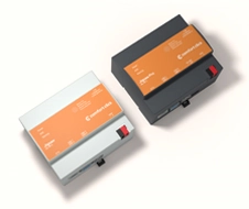
 bOS apps
 Examples library
 Documentation
 Video tutorials
 Forum
Forum Knowledge base
 Help desk
 FAQ
FAQKNX visualization: from group addresses to a UI people actually use.
KNX is a robust automation backbone. Visualization is the human layer on top — dashboards, floorplans, scenes, alarms, and trends that turn a technical installation into something clear and comfortable to live with (or operate at scale).
What is KNX visualization
In a KNX project, the real control lives in the field devices: sensors, actuators, room controllers, meters, gateways. Engineers define group addresses and datapoint types (the meaning/format of a value) in ETS, and devices exchange telegrams on the bus. A visualization layer connects to KNX (typically through KNXnet/IP) and turns those group addresses into UI elements — buttons, sliders, room views, floorplans, dashboards, and trends.
A common misconception is that visualization replaces the installation. It shouldn’t. Good KNX systems keep essential logic and manual control on the bus (and at local switches). Visualization adds overview, context, and convenience — especially when the building is larger than a single room or a single subsystem.
Why people add visualization to KNX
KNX is excellent at dependable automation, but daily life (and facility operations) is about understanding what’s happening. Visualization is the bridge between a distributed control network and real users.
What problems it solves
- Complexity: hundreds of objects become a few simple screens.
- Overview: see the state of lighting, HVAC, shades, and energy in one place.
- Troubleshooting: spot abnormal states (stuck outputs, missing feedback, overheating zones) faster.
- Remote support: diagnose without a site visit when the network is set up securely.
- Consistency: provide the same experience across wall tablets, mobile, and operator stations.
Where visualization delivers the most value
Homes & villas
Room-based control, favorites, and scenes that keep daily use effortless — without hiding manual switches.
Offices & campuses
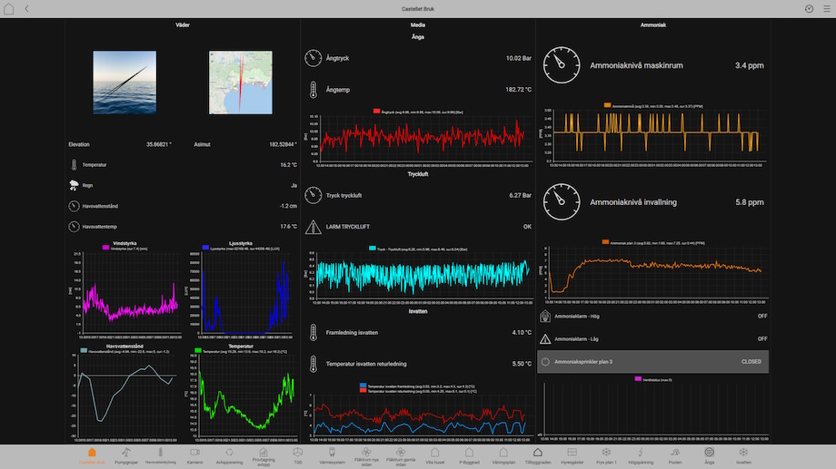
Operator views, alarms, and trends that support facility teams, energy goals, and quicker fault isolation.
Hotels & multi-tenant
Role-based access, standardized guest UI, and staff dashboards that scale across rooms and floors.
Energy-focused projects
Metering views, peak alerts, and automation modes that help reduce consumption without hurting comfort.
The secret is focus: a great KNX visualization doesn’t try to show everything at once. It highlights the few controls and states users need right now, and keeps deeper diagnostics one tap away.
The building blocks of a great KNX visualization
A clean data model
- Keep group address names human-readable and room-oriented.
- Use correct datapoint types so values scale/format correctly.
- Separate commands from status where the device supports it.
A UI designed for roles
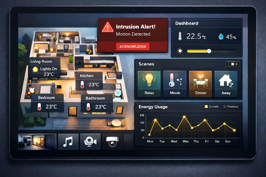
- Use room pages for daily actions and a dashboard for overview.
- Offer scenes/modes (Away, Night, Meeting, Cleaning) instead of dozens of toggles.
- Make critical status visible (heating active, alarm, window open).
Operations & lifecycle
- Role-based permissions and an audit trail for changes.
- Alarms, notifications, and trends for proactive maintenance.
- Document mappings so future edits don’t break the UI.
How visualization connects to KNX
Many KNX visualizations connect over IP using a KNXnet/IP interface or router. That keeps the bus dedicated to field communication while the UI runs on familiar IP devices (tablets, phones, PCs, kiosks). If you are using a ComfortClick Jigsaw or Jigsaw Pro server, bOS can also connect directly via the built-in KNX connector.
Typical architecture
Keep essential logic on the KNX bus; use visualization for overview, trends, and convenient control.
Common deployment patterns
Wall panel visualization
Great for rooms and small sites. Keep essentials big, fast, and offline-tolerant.
Local server/controller
Centralize users, trends, notifications, and cross-protocol logic while keeping KNX local control intact.
BMS / SCADA integration
For larger sites, aggregate KNX into an operator stack so multiple subsystems can be monitored together.
Design checklist (field-proven)
If you want a visualization people recommend (instead of tolerate), design it like a product: clear structure, predictable feedback, and a path for maintenance.

What to get right
- Start from user journeys: Arrival, Away, Sleep, Meeting start/end, Cleaning — then map to devices.
- Build navigation by spaces: Floors → rooms → key actions (lighting, climate, shades, audio).
- Always show feedback: don’t assume a command succeeded; display status objects and current values.
- Make scenes explicit: name them clearly, explain what they do, and keep them consistent across rooms.
- Design for failure: if the UI is offline, core KNX functions should still work locally.
- Separate roles: occupant vs facility vs service; protect advanced settings behind permissions.
- Keep the UI calm: avoid flashing dashboards; use clear states and a single alarm/notification center.
- Document and back up: keep ETS exports, mappings, and a handover checklist for the next engineer.
Achieving KNX visualization with ComfortClick bOS
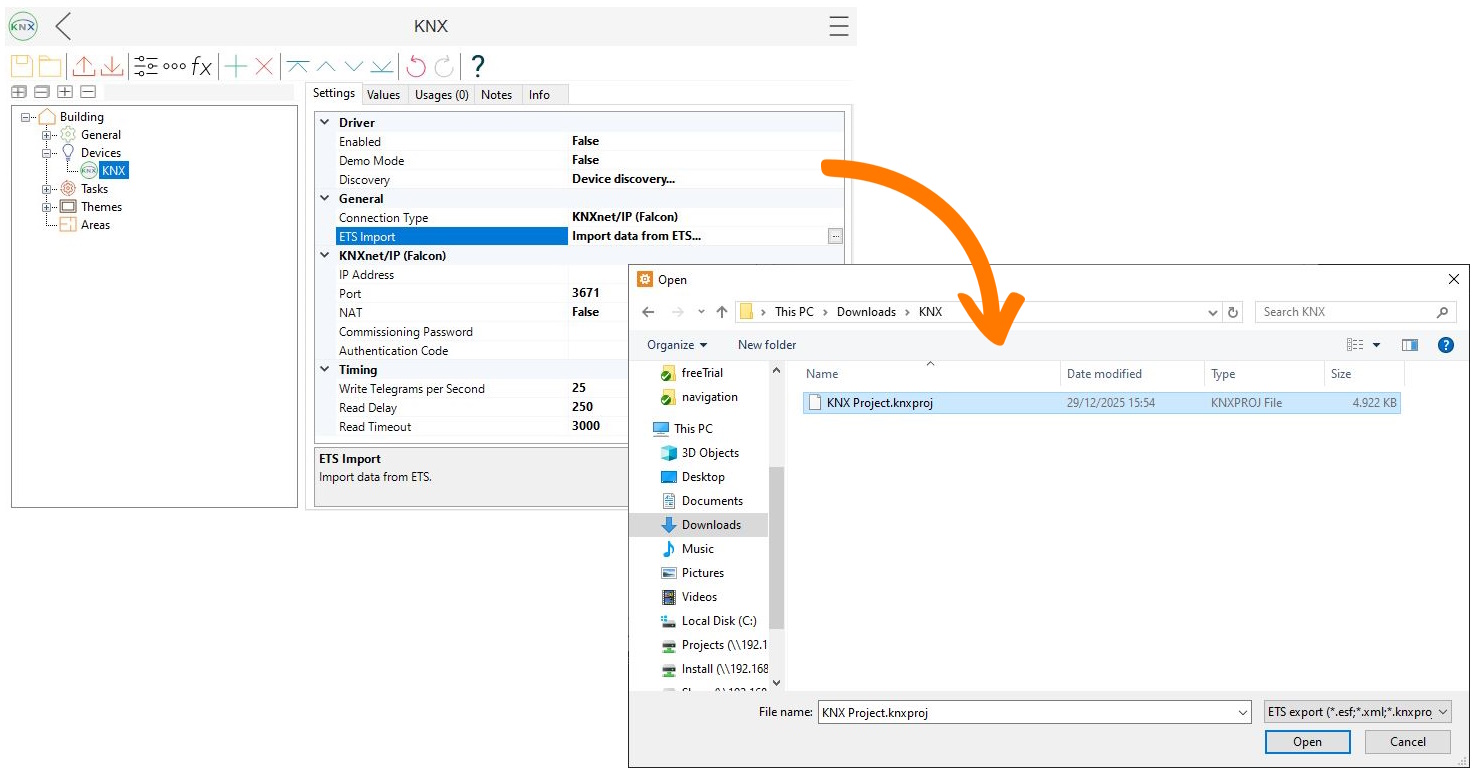
ComfortClick bOS can connect to KNX via KNXnet/IP (IP interface/router) or directly via the KNX connector on ComfortClick Jigsaw and Jigsaw Pro, then turn ETS structure into a working project. Below is an example flow in bOS Configurator.
Connect bOS to your KNX installation via KNXnet/IP (IP interface/router) or, on ComfortClick Jigsaw / Jigsaw Pro, via the built-in KNX connector.
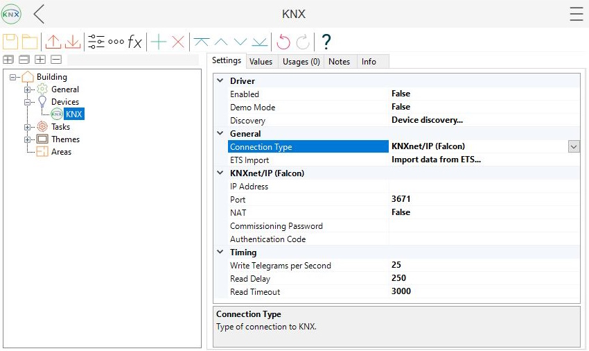
Bring in group addresses and datapoint types (e.g., from a .knxproj file).
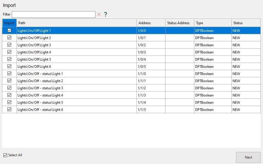
Choose the datapoints you need for the first iteration of the UI — especially the command + feedback pairs for key devices. Keeping the import focused makes mapping faster, navigation cleaner, and reduces the chance of binding the wrong group address.
Assign the status/feedback group address so the UI reflects the real bus state, not just the last command.
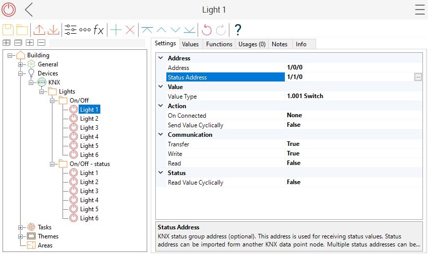
Select a template — in this example it’s Lamp, so it will show as a lamp on the UI.
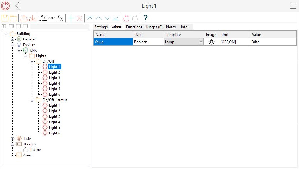
Drag & drop the node into the Theme (in the screenshot, Light 1 was added to Theme).
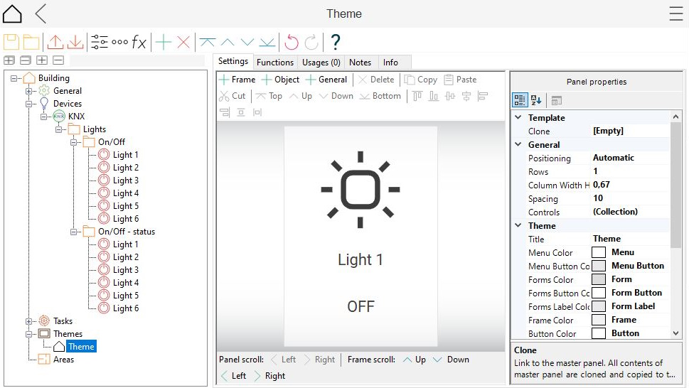
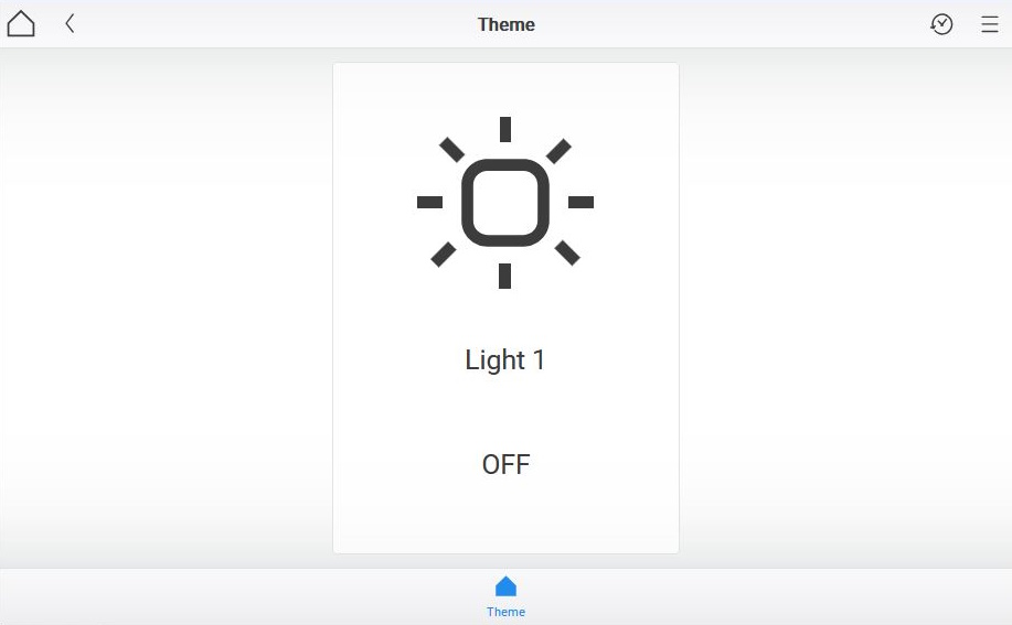
Preview on a real client and verify the full loop: send commands, confirm feedback updates, and check that controls behave as expected.
When the basics work, the next step is making the UI feel finished: consistent navigation, clear feedback, good spacing, and reusable templates. If you want to go deeper with bOS and build more advanced, better-looking visualizations, these resources are a good place to continue:
- Getting started — recommended next steps and how to sign up for introductory training.
- YouTube playlists — walkthroughs and feature demos.
- Knowledge base — deeper documentation and troubleshooting.
- Examples library — ready-made projects you can open, inspect, and reuse.